UX Feedback on Gridfield "Link existing" field

This is not really a feature request. Just a quick summary of an interesting interaction I had with a regular user.

Our QA team member was testing a recent fix we made to the Gridfield “Link Existing” UI. Our QA team does not spend a lot of time in the Silverstripe CMS Admin UI, so they are not intimately familiar with how it works.

Here’s the screen, our QA team member was reviewing:

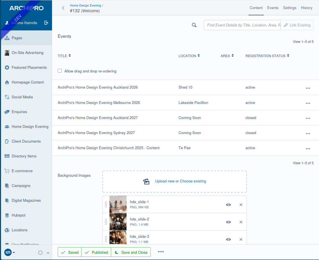
Here are some of the things she got confused with:

  • She thought the :magnifying_glass_tilted_left: icon was related to the the “Link existing” field.
    • She wasn’t sure if the search was meant to be searching just entries in the Gridfield or all possible entries.
  • After selecting an entry from to “Link Existing” autocomplete drop down, she didn’t realise that she needed to click the “Link existing" button for the change to take effect.

She wasn’t sure if the search was meant to be searching just entries in the Gridfield or all possible entries.

Yeah the placement of the search icon has always felt off to me, it’s kinda hovering above the gridfield so doesn’t feel connected to it (especially if you don’t have link existing there)

This is a very common question/issue raised by our clients. With the search icon sitting right next to the ‘Link Existing’ input, admins often start typing their search terms into the Link Existing field when they want to filter their Gridfield. I think the placement of the icon and that it doesn’t stand out as a button adds to the confusion.

The UX team has taken a crack at this. Further discussion about this can be in the GitHub issue: Reduce confusion with GridField filter and "link existing" functionality. · Issue #2006 · silverstripe/silverstripe-admin · GitHub

2 Likes